Wednesday, August 19, 2009

Monday, August 17, 2009

works updated

draft #2, please comment/email me.

GOING FOR ADS

In this group of work I have used only internet advertisements to create pieces concerned with how internet users navigate, perceive, and conceive of the medium of the web site and the internet as a whole. The title of the series is a reference to the phrase “going for adds” used by music distributors in reference to the date the new album of the artist they are promoting can be first played on the radio. In seeking out internet advertisements I am doing the opposite of what internet users have trained themselves to do since the inception of internet advertising which is to ignore such ads. As fast as advertisers devise new ways of making “impressions” on users, users adapt to these tactics and become immune to them just as quickly. The term “banner blindness” has been used to describe the phenomenon of users instinctively ignoring the advertisements that frame the content of web pages, thus eliminating the use value of these areas to both advertisers and users alike. In the same way that going to see the Great Pacific Garbage Patch seems to be the only way to believe in and understand it, I have sought out internet ads, in a sense the visual refuse of the internet, and appropriated, reconfigured, recycled, and collaged them so as to finally acknowledge their existence, examine how internet users orient themselves online through sight, and perhaps create beautiful images out of compositional elements that are otherwise intuitively ignored by the eyes of internet users.

Average Impression

This is a collage of 66 nearly-transparent vertical-format banner ads (approximately 160 x 600 pixels) that, when layered on top of each other, create something of an average of composition and color for this size banner ad. I see it as something like the ocular impression made from years of seeing-without-consciously-registering innumerable instances of ads of this shape. Light emanates out of the computer screen through ads like this from the edge of web pages into the edges of the users’ retinas but is rarely if ever the focus of its vision. Here it is both brought in an out of focus – an abstract form representing something of a template for all ads of its kind. While the true intensity of a star in the night sky is often clearest when seen through one’s periphery, this piece instead confronts the eyes with a record of what they have simultaneously seen and not seen on almost every web page they have ever explored.

Depth of Field: Ad Pool 118

This piece combines 118 internet ads of all different shapes and sizes. Ultimately, no one ad is completely visible or legible, and the viewer has the choice of either attempting to make out individual ads or allowing the composition to visually wash over them as a whole. I see this as a revisiting of the moment of the decision made by the internet user’s mind, manifested through its use of eyesight, each time it is confronted with a new advertising strategy. It can be simultaneously appear a depthless two-dimensional surface of ads and a deep pool of colors and imagery which combine to create a greater combined image (or illusion).

Deductive Structure: Army Chasm

This piece was inspired by Frank Stella’s early paintings made with concentric black brushstrokes of uniform-width in which each painting’s content was dictated by the shape of its stretcher bars, its edges. Here, a banner ad for the Army Reserve is copied ad infinitum, creating an image of concentric borders which frame and re-frame an ever-receding, dissolving void where online “content” would normally reside. In their innate search for e-“substance,” our searching eyes are instead confronted with and enclosed by a two-dimensional chasm of imagery they are trained to literally marginalize if not completely eliminate.

Newer Realism

These pieces were inspired by the Nouveau Realistes, a group of artists in Paris in the early ‘60s, some of whom (namely Jacques Villeglé and Raymond Hains) made collages using scraps of street advertisements. My “collages” layer “scraps” of banner ads over each other to create abstract final products, a digital revisiting of the technique of the Nouveau Realistes who strove to create a heightened realism in their works through the recycling of society’s detritus. The juxtaposition of my digital works with those of Villeglé and Hains draws attention to the question of depth in the plane of the browser window and asks the viewer to reconsider his or her conception of the materiality of the internet.

Topography

This piece was inspired by Maya Lin’s topological cut-outs of atlases. In my piece, banner ads are cut up and arranged so as to confound the viewer’s sense of depth on an internet page. The piece can simultaneously be seen as two holes through a pile of banner ads receding into the screen, two towers of banner ad pieces rising out of the screen, or simply a series of perfectly fitted rings cut from different ads.

Sunday, August 16, 2009

I emailed this to Nick yesterday re: his initial descriptions of his work.

"In seeking out internet advertisements I am doing the opposite of what internet users have trained themselves to do since the inception of internet advertising which is to ignore such ads. As fast as advertisers devise new ways of making “impressions” on users, users adapt to these tactics and become immune to them just as quickly."
- relates to: topology, the eyes constructing a surface of vision (which could be viewed as a kind of material---the surface painted over and presented to the mind by the roving, editing, slap-dash eye)
- so maybe---is the kind of surface you've composed what we're actually "seeing"?
- and in general, if this is what we see, or if these pieces speak to what we might be not-seeing, are we seeing anything at all? the choice you've made to inundate our eye with streaks of color---formless, information-less---reminds me not only of the hectic overload of ads, and the sometimes-necessity of self-editing them (for sanity's sake) but of the anxiety this implies, i.e., am i getting anything at all? what information am i missing if i can unwittingly edit my informational intake, even as i spend a long time "reading" a page?

"analyze their aesthetics," going out to the garbage patch to see it
- i don't think you're analyzing the aesthetics of the ads, or holding them up to the light, or "going out to see them" a la the patch---that project would be like a shitty andy warhol diptych thing, don't you think? i think what you're analyzing here is sight and sight as orienting us in and creating our understanding of online space. the object here seems to be sight itself, not what is seen (although you talk about vision through re-formulating what we see/don't see).
i think this could relate to some writing i'm doing about the internet as a text, and text (and as an extension, banner ads) as space


"and perhaps create beautiful images out of compositional elements that are otherwise intuitively ignored by the eyes of internet users."
- i think you're creating beautiful images that SHOW blindness in a really cool, seemingly-contradictory way. like, what we see is an illustration of intuitive ignorance/blindess.

Saturday, August 15, 2009

two responses

gyre-ads+balanced+118

a stationary pool of gasoline and oils floating above melted and coagulated printouts of web text. in this i mean there is the deception of the organic, when we gaze at the rainbow refleted out of the gasoline pool, sickening runoff and refuse. the same deception is found in the deep orange and red, toxic sunrise and sunsets, measurements of pollution levels and fucking great desktop pictures.

rather than a collage effect, that is, a strictly two-dimensional ransom-note style cut and paste, you've made a painting, of course. the colors bleed into one another, oil or acrylic or whatever kind of cyber-paint that never really dries, retaining its wet glossiness.

i stare long enough and i see a face, some type of mouse-shaped skull, anthropormophic and pissed off. a hint at three dimensions. a ghost. the kind of image from a newspaper you find in the park or the forest, that's been sitting out there in the dirt and rain for days, all the print colors slowly smushing into each other.

i see clouds too, i think. vanilla and toxic. good call with the number 118.

army+chasm.

this is great. can you make it really really big? because the image expands beyond my screen all i can do is put two fingers on the mouse pad and swirl it around a bunch. if i go side to side it feels like i am turning my head to look different sides of the hallway. beginning to go in swirls makes a spiral, and going in swirls very very fast makes triangles. see? okay now i am nauseous.

Wednesday, August 12, 2009

Monday, August 10, 2009

Friday, August 7, 2009

visual foragers

An interesting metaphor I've come across in the "website usability" community is that of internet users as animals foraging for food and sites having varying levels of "information scent" drawing users their way. To try to tie it into the garbage discussion I'm reminded of the Flower Island film Adrian posted, in which third-world pigs and people - in that order - forage for sustenance among the refuse of first-world society. To combine this with the garbage patch metaphor of the internet, one could consider internet users as the foragers from the film, each adrift in his/her/its own raft among the gyre of information spiraling through the internet void/ocean, passing through/over the invisible mass, trying to sniff out their own desired fare.

The way we forage is what I've been been thinking about lately, and this site Alert Box has been my main source of non-theoretical, practical research from inside the industry, especially their "eye tracking" technology. I recently used their findings to create this piece (below) that uses the F-shape pattern, especially pronounced in Google search analysis, to relate to the Pacific Garbage Patch and the idea of things being incomprehensible when not visualize-able. It's simple but I like it, though I'm guessing it would be much less effective/interesting without explanation of both sources.

(click to enlarge)


I feel like this also ties in with Lizzie's thinking about the materiality of vision.

Thursday, August 6, 2009

while you work

http://www.tenement.org/folksongs/client/

sound map!
this was just one of the sidebar links to the google-maps-killed-bambi article.
it's also really pretty to listen to, i think.

eyesight as material --> affectivity as a reading of this material?

That article about blinking is really cool. This info about synchronized blinking inspires some pretty paranoid conclusions. I think this reveals the extent to which the visual sense is seen as the ultimate conqueror of space, the ultimate/unproblematic linking of navigation and mapping into an instantaneous procedure of traveling eye movement and a corresponding "true" knowledge of existing space and its components. And I think this new awareness of patterns of blinking and our accumulative blindness means that we begin to view eyesight as a representational strategy. I think this means we have a new relationship to eyesight as a type of material. Both the infallibility we accord to the eye as a navigating/mapping device and our new understandings of its lapses as such points towards a consideration of seeing as a representational strategy, a representation that the eyes (and brain) create for the mind. What I mean: in realizing that the eye fails to map all space by seeing (or that it doesn't see space, but that this space nevertheless exists, not just objectively but exists to us despite its not necessarily being SEEN), we begin to recognize sight as a certain material representation of a reality that eludes the senses, gesturing to us from elsewhere.

hm

I realized what I just posted is without indents or bolding, so I'm just going to email it as an attachment to everyone.

Notes so far

I think right now I'll just post come of an outline of ideas I've been working with...let me know how it seems to be interacting with you guys' thinking (or not).

- The aim of the kind of academic scholarship based around the interpretation of primary documents can be thought of as an effort similar to the one described by Borges' fable of the cartographers—an attempt to locate the holes in previous study, uncover as-yet-un-thought intellectual territory, claim it, and cover it over, "point for point," with scholarly interpretation ().
- “…digitizing all the library catalogues and deep Web material in the world does not help if the information you need is not there in the first place—and for much of the most interesting kind of research that cataloguing information does not exist” (Landow, 40).
- Landow’s comment energetically claims that the most exciting intellectual substance is that which exceeds the archive, and part of bringing it into the archive—the map of the known—renders it already-read and in some sense makes it invisible, as it loses its un-explored, virginal potential
- In this way, the archive functions to categorically erase the potential of its content, serving as a mausoleum to conquered intellectual territory
- The archive saves only to exclude its content from the un-known lands of the innovative
- Of course, archived scholarly material can become the object of future study, representation replacing the “real”-ness of the primary documents, just as the map in Borges’ tale began to fray

- The relationship of those who flatten out and bring into the light previously un-known sermons, letters, documents to this information is in this way complicated  what does it mean to have discovered and mapped this intellectual space? Its relationship to its cartographer seems lingering and conflicted, for to find and write about newly-discovered primary sources means both to uncover and recover
- Landow’s anecdote about the old John Ruskin correspondence he found in Ruskin’s goddaughter’s garage when she asked him if he wanted to “look through some old things,” reads not just as an entertaining “barefoot-in-the-snow” story or as a counter-point to the supposed usefulness of internet catalogues, but as an effort to reactivate the excitement of coming upon a hole in the current spread of historical data, which, by virtue of his discovery, became just some more papers in a vault—deadened not only by their membership to the house of the already-known, but submerged under the more accessible, more trusted reading that he himself published about them
- What happens when original source material gets published to the internet in conjunction with the book that would have previously eclipsed it, reburied it in the archive? The internet here is being used to combat the archive as a mausoleum to the already-known
- Karl Jacoby published hundreds of pages of original court documents from the Camp Grant Massacre of 1871 on the companion website he created for his book Shadows at Dawn
- Instead of reducing the immense volume of information into a single narrative, Jacoby hopes that stretching the boundaries of his work to include its sources will both map more thoroughly and allow knowledge to be mapped again and again.
- It’s tempting to say that there is no text, since its boundaries are potentially infinite
- no difference between the “hard” and “soft” links a reader can truly establish new connections through linking materials
- Jacoby is using the immense storage capacities of the internet to widen the reach of what is considered his “work”
- “Even when an individual has been accepted as an author, we must still ask whether everything that he wrote, said, or left behind is part of his work. The problem is both theoretical and technical. When undertaking the publication of Nietzsche's works, for example, where should one stop? Surely everything must be published, but what is "everything"?” (Foucault, 2)
- Jacoby’s publishing action presents readers with a very different relationship to the material than it would had he published all the sources in a printed volume, in which case his own work would seem a minute preface to a re-published historical text
- Does Jacoby’s relinquishing of his material simply add to its impressive scope, i.e. do we still see him, as primary reader, as still “owning” the territory of his source? Does the publication of his source material really allow access, or does it merely reinforce the scope of Jacoby’s efforts?
- Jacoby’s articulation of this relationship is telling. In deciding to create links to hundreds of pages of original source material on the website that accompanied Shadows at Dawn, Jacoby spoke of his desire to “un-flatten” the project
- He hopes to utilize internet-specific concepts of space and accessibility to immerse readers in the material on the companion website
- As if each 2-dimensional page of his interpretation would be built up with layers and layers of its own history, suddenly sharing a kind of three-dimensional space in which the entire flesh of amorphous original material could be accessed along with the particular trail of thoughts and associations Jacoby had bore through it
- As if that which had once eluded the archive, and had been chewed-through and used up through its discovery and interpretation, became instead an endless playground for new learning and new discovery
- The evocation of a 3-dimensional information space in which viewers are invited to navigate is crucial
- Points towards a new conception of materiality as it pertains to the process of reading/writing, orienting an idea of the material towards experience as the material of narrative, the experience as the production of a map of an individual’s travels through intellectual territory
- User not just as the origin of action but as the producer of an intellectually groundbreaking experience and a narrative of knowledge newly-mapped
- There is no “work” except for the pages we have viewed, and in viewing, have bound in time through experiencing them sequentially
- There is no narrative arc except for the story of how and why pages followed one another in a user’s exploration
- The fact of a user’s navigation becomes the both form and content
- Theories about what it means to read, how readers associate and wander through endless pluralities of meaning, [“…the reader of a text may be compared to someone at a loose end…this passably empty subject strolls…on the side of a valley, a oued flowing down below (oued is there to bear witness to a certain feeling of unfamiliarity); what he perceives is multiple, irreducible, coming from a disconnected, heterogeneous variety of substances and perspectives: lights, colors, vegetation, heat, air, slender explosions of noises, scant cries of birds, children’s voices from over on the other side, passages, gestures, clothes of inhabitants near or far away. All these incidents are half-identifiable: they come from codes which are known but their combination is unique, founds the stroll in a difference only repeatable as difference,” (Barthes 159)] are different from the process of choosing links, and although the processes are obviously connected, they shouldn’t be conflated
- clicking links does not equal a direct manifestation of one’s individual associations and experience of meaning
- association is different from choosing and clicking; a passage through and weaving of associations is different from a sequence of chosen pages
- the mental processes we think of as happening in the human mind as they read, line by line, page by page, a fixed text, we think of as happening in the creation of the “text” space itself, but they should not be conflated!
- is this why we see hypertext as theory “come to life”? like associative trails are not made against and through and around the printed text, but as the very binding experience, ordering, and existence of a hypertext experience

- This contributes directly to our concepts of how we exist in the internet’s “space,” where we conceive of ourselves to be in the virtual binding of page to page as we navigate, choosing to link page to page as we go
- City metaphors vs. ocean metaphors—basically a question of, is there any structure here that is external to our own continual present of viewing page after page? Does space close in around me, or is it marked?
- Also for the ocean: what kind of thinking potential is there in this space? Has it been traveled over, or is it nebulous and un-charted?

SADIE PLANT – Zeros + Ones
- “at sea”  regressive, primordial implications
- she relies on Michel Foucault
- ocean used to refer to unit-less, genre-less thought
- “…dealing with the floods of data which have burst the banks of traditional modes of arranging and retrieving information and are now leaking through the covers of articles and books, seeping past the boundaries of the old disciplines, overflowing all the classifications and orders of libraries, schools, and universities,” (10)
- what does the use of this water metaphor imply?
- the force of the formless, its uniform pressure, breaking through the boundaries of classification through which the categorized derives meaning and secures its place in the archive
- the formlessness of the primordial
- naturalization
- “…so the digital machines of the late twentieth century weave new networks from what ere once isolated words, numbers, music, shapes, smells, tactile textures, architectures, and countless channels as yet unnamed,” (11-12)
- fabric-making as the transformative binding of formless, liquid “channels” of information and thought-substance through which the product of this media is articulated
- “the yarn is neither metaphorical or literal, but quite simply material, a gathering of threads which twist and turn through the history of computing, technology, the sciences and arts. In and out of the punched holes of automated looms, up and down through the ages of spinning and weaving, back and forth through the fabrication of fabrics, shuttles, and looms, cotton and silk, canvas and paper, brushes and pens, typewriters, carriages, electrical filaments, silicon strands, fiber-optic cables, pixeled screens, telecom wires, the World Wide Web, the Net, and matrices to come,” (12)
- fabric as the oldest material for transmitting information
- each new technological development as evoking this ancient substance, this original medium
- actually, fabric is separate from the apparatus of its weaving, so weaving as a process analogous to computing must be thought of as broken up into distinct processes—ie. the mechanics of weaving (shuttles, etc) and the information, which the yarn represents
- there’s a kind of division coexisting in the thread metaphor—it is both and alternately the means (medium) and the thought-material itself
- linearity
- in terms of narrative (multiple entryways to a single narrative—but this narrative is, or may be, constructed linearly from the outside, it’s just that you have the opportunity to enter anywhere…but this is true for a book as well…it’s only that you have no sense of the rest, of the body, of all the pages before and behind you—this seems to be a major component of our reading practices on the internet) (this seems to be a big thing, the constant present of space and time, even with the “back” button, you have nothing except a re-created here and now point, still without material presence of the other nodes, other threads)
- in terms of data retrieval (not having to cycle through all the information to get to the piece you want)
- this experience of disrupting linearity seems more about digital/mechanical processes than reading experience

Wednesday, August 5, 2009

Affective ZenoPhobia

i've been moseying around on some affect articles... haven't been able to get that one wendy recommended by ien ang, 'in the realm of uncertainty', but

brian massumi
has his own website, as does steve shaviro

massumi's introduction to parables of the virtual, 'concrete is as concerete does', is interesting. it's a bit general, being an introduction, but i got some really golden stuff out of it, especially in terms of affect and navigation.

he uses one zeno's paradoxes to talk about movement. the paradox works in that if someone shoots an arrow, it has to pass through a certain number of points to get to its target. however, because there are an infinite number of points in space, and infinity has no end, the arrow in theory should never arrive at its final destination.

obviously it does, and hence the paradox. one of the answers to the paradox (which is bergson's) is that there is a differentiated between space and movement. movement cannot between broken into discrete, "extensive' locations. as beautiful as muybridge's animations are, they are beautiful because they are inherently asymptotic, and will, of course, never be able to fully map/capture the qualitative/intensive experience of human movement.

where massumi takes this to the next level is that once the the arrow actually stops, we can map it.

and therefore:

"A thing is when it isn’t doing. A thing is concretely where and what it is – for example a
successfully shot arrow sticking in a target – when it is in a state of arrest. Concrete is as
concrete doesn’t."

so a thing becomes concrete when it stops becoming, yeah? this fits well into the problem of trash, especially with the gyre and the beaches. we can't map the gyre because the objects are in a constant motion, whereas once trash stops moving, that is when we can manipulate it, or have a more affective relationship with it??

the question of navigation comes up pretty heavy here--and another physics paradox too, when does 'stopping' begin and end, when does 'starting' begin and end? when are we sure that we are navigating, and when are we sure that we have stopped? in terms of navigating the internet, how do the pre-meditated structures from websites to advertisers dealing with the problem of forcing an internet surfer (shouldn't we say drifter??) to follow a certain path?

massumi jabs at the practice of semiotics and representation, that signs are not just based on deconstructed linguistic/cultural/cognitive meanings, but on their location, when they stop. a trash bag has a totally different signified meaning based on its location. i guess that's obvious, but something to keep in mind


Also, cool article, cool blog. reminded me of the eye-surveillance stuff.

life

death

Sunday, August 2, 2009

newer realism

So as I've been making these transparent collages on photoshop using internet ads (A post with a few of them is coming soon) I was reminded of the art movement in France in the '60s called Nouveau Realisme, a faction of which was artists making decollages using torn pieces of street advertisements.

(In the pieces I've made the opacity of the ads is all very low so they are all sort of visible and invisible/unreadable/transparent at the same time, which seems like an appropriate progression from the technique of Nouveau Realists like Jacques de la Villegle and Raymond Hains (above).) Anyway, I'll have more to say about my stuff when I put it up but this line of research reminded me of the artist Arman who was also in this group but made mostly sculptures and collections of objects. (He also did stuff like make "paintings" using paintbrushes like this version of Van Gogh's Starry Night.)

In response to Yves Klein's works centered on the concept of Le Vide, e.g.

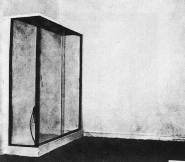
...Arman filled a gallery with garbage, calling it Le Plein (basically, "The Full"):

From this, then, came a series called Poubelles which were large glass boxes with collections of junk (some "garbage" some not) in them. The decollages are more directly related to what I'm making now but the Poubelles seems like a perfect predecessor to something we could/should make, Adrian.

Anyway, that's where my head's at right now. Let me know what this stuff does for you guys.

P.S. Google "trash" and you get a map of your city with lots of destinations.

P.P.S. Thought I'd give this a shot; efforts thwarted though. How appropriate (click to enlarge):


PPPS#!&: Lizzie check out this crazy ish! EYE TRACKING. Relates to our computer installation/multi-feed video surveillance ideas right??

Saturday, August 1, 2009

vortex/invisibility/navigation ideas convo

Adrian: okay well the idea is like you move around the city drifting instead of being ordered
the thing about the garbage patchis that it just driftsandEITHERit gets stuck in the vortexwhich is where most of those rubber duckies are, actuallyorit hits somethinga beacha beach that sticks out into the vortex
me: mmhm
Adrian: so land is either created or destroyedbasically
me: waitwhich is which
Adrian: i dunno!i haven't figured out a thesis or anythingbut i think the connection is definitely there
me: like, you could say land is created by trash being beached or that it's destroying the beach?
Adrian: okay soi don't know exactlybecause i still need to read a bitbutthe garbage patch starts and ends at the drifti have a lot more to say about the patch toobecause it exists even less than i thought it did
me: how so?
Adrian: wellbasically: its not really in the vortexesits in a space that connects these two larger cortexesmost of it is between a couple feet below water and 100 ft under waterANDit varies every yeardue to weatherbetween these certain latitudes
me: **** so its even more impossible to see or track
Adrian: over 1,000 milesin el nino years it gets even more ****** up
me: in what way
Adrian: well one year it could be at at 37 N. and the next it could be at 53which is 1,000 miles separationand then in el nino the currents go really crazyso it could get pushed in a completely different directionbasically it drifts like mad, sort of in circlesso basically
me: who's tracking it exactly?and how?
Adrian: some homies
me: ah
Adrian: i'll hook you up with this videocheck this out too:http://strangemaps.wordpress.com/2008/05/
me: this rules
Adrian: yeahbut check it outone of the only ways they can actually track surface currentsis with these huge trash spillsone of them was with 80,000 nike shoes
me: whattttt
****

Adrian: yeah
me: so they act as like buoys
Adrian: basically
me: actually helping scientists in a way
that's a whole new dimension
Adrian: exactlyANDsome beaches have left shoes and SOME have rightbecause of they way they float
me: no way.
Adrian: !!!
me: hahaahahahahhhh *******
Adrian: totally ******* seriouscheck out this video its awesomehttp://www.pbs.org/kcet/wiredscience/video/116-flotsam_found.html
me: i thought you were joking about the ducks**************
Adrian: no manthe ducks were revolutionaryso some of them end up in scotlandbut the majorityare in the vortex
me: tough break scotland
Adrian: 1,000 at auctionno joke
me: what?

Adrian: if you find one of the original ducks it's worth mad money you know whats funny i think the nike shoes float cuz they have air in themok but start thinking about this drift ****i should really talk to lizzie because it has tons to do with navigationbut yeahthe only way we can 'see' the garbage is sort of likewhen we stick our hand into the water and try to pull out whatever we canand no matter what it's just....randomtrashalso: wormholebecause once something goes into 'vortex'it might not come out for 50 years and on the other side of the world

Friday, July 31, 2009

I think your two observations that
a) statistics aren't applicable here and
b) a postmodern map might try to represent through inscrutability
are the reason the gyre appealed to you in the first place, when you kept saying how some people thought the gyre was the size of Texas--no!--of France!! etc etc., and how mind-blowing the disparity between and enthusiasm embedded into those claims is. I think that's why the gyre became such a good focal point for these questions, because it eludes our efforts to map it in traditional ways. Again, though, I think it's really important (and this is something I'm trying to apply to my own thinking as well) not to see the gyre as an un-problematic, living definition of these post-modern issues of (non)place and non-mappability.

I think that both potential points of comparison are interesting, but why do you need them? I guess it just seems like a lot of work to take on at this point. The landfill is pretty awesome though---the way a certain type of non-place is being made even more invisible, literally being buried under the earth to make way for a new surface, one that we will be quite able to say is 3x Central Park or whatever.

Isle of Flowers made me think about two things:
1. The desire, when talking about global economy and trash as its symptom, to extract and re-commodify some small representative object---a tomato, some bath toys (that's so crazy!!! little sailors in one big bathtub--how perverse), or I'm also thinking of that Dave Eggers essay in which he traces a t-shirt that some kid in a third-world country wears back to its origin (people talk about that a lot---startling photographs of refugees wearing Celtics t's). This attempt tries, I think, to make garbage speak by re-integrating and re-mapping it into the global economy. How can garbage speak of the global economy without returning to it?

2. The end of Isle of Flowers, when the women and children collect the plant matter, seemed to me to capture an interesting place in the chain of things...when an object has been pressed and squeezed and all the exchange value has been wrested from it, use value still remains in a perverse way. I'm not exactly sure what I mean here, but it seemed like trash as this underbelly and these people as a kind of underbelly so destitute they had fallen so at the bottom of the chain almost seem exempt from it---a loaded comparison, definitely, but both the garbage and the people represented this kind of map-less, obligation-less, exchange-less parallel system of values, places, and networks.

I'm working on writing today, I'll send it to everyone later tonight or tomorrow, hopefully.

Thursday, July 30, 2009

speaking of trash

so, back fro california. there's a lot to be said, as always. i'll try to be making short updates every day compiling some of the stuff i've been working at.

to preface things:

you should all should watch this movie... i saw a couple years ago and, along with darwin's nightmare (which has a lot to do with trevor paglen's blank spots), made me want to be a documentary filmmaker.

check out the the isle of flowers

it's only 12 minutes, and a really really amazing film.

anyway

NB: i'm very tempted to try to 'understand' the complex systems of trash flotsam/jetsam, recycling science/providures, same with landfills, but i realize that my main concern should be representation, not actually creating my own sort of enlightened understanding of these processes (at least scientifically, looking for the their 'true' form)

that is, as an interpreter, i can't expect to create my own 'map' of the garbage gyre, or of another spots of trash, mostly because i don't have the resources. i guess that's what film school is for.

one of the reasons why i think this film is so helpful is that it is an amazing representation of the relationship between humans and trash. also, watching it after having read marx gives another important level to it. that is, understanding the consequences between exchange value and use value.

i wonder if marx ever talks about garbage.... garbage is the underbelly, or perhaps, the dark side of the society of the spectacle (thinking of debord here). i know marx talks of the 'ghost' of labor value. we can look at an object and realize that it on an ontological level it contains the energy and power of some human being, somewhere. but i'll admit my knowledge on marx is limited, so feel free to call me out here.

this could definitely go into nick's area of research. spam, of the internet, is an interesting combination between spectacle and trash. its hope is to gain our attention, to call out to us, to say 'look at me, follow me!', but by virtue of that quality it turns into trash (nick you really should read that book on the development of the commodity in victorian england if you haven't already, it's where most of this is coming from).

back to problems with GIS...

i planned on trying to use GIS as a way to examine trash, but i'm getting wary of it. reading jameson's article on cognitive mapping, it seems that he values aesthetics over information. that is, he says that art should teach us, but it's still aesthetics. my concern with GIS is that it might be too statistical for what i'm looking at here. and also, really, i haven't found any GIS maps of trash, but that might be saying the same thing: we don't really know how to turn trash into numbers, or numbers that make us money. trash only turns into exchange value for a select group of people.

the isle of flowers turns up that dichotomy even more. if we're looking for affect, statistics will only get us so far. and for maps, at some level, i think aesthetics come first. in a 'postmodern map', we need to rely on a certain amount of unrealiability, of infallibility.

here's where you guys come in. i want to compare the non-space of the gyre to one of two other (places).

basically, i can see trash collecting in one of these two other spaces: on seashores, and in landfills.

seashores are appealing because they, opposite of the gyre, are the definite marker of a 'space. nothing makes a darker line on a map than the area between land and ocean. also, trash/flotsam makes it way either into the gyre for eternity, or back onto land (or finds its way out of gyres, and back onto land.)

but landfills are fascinating also, and one in particular: the fresh kills landfill.

it's no longer a landfill, but for fifty years it resided on staten island as not only one of the largest landfills in the world, but the largest structure in the world. its total volume was greater than the wall of china. visible from land, space, everywhere. medical waste (hypodermic needles) littered miles of jersey coastline in the late 90's.

and now: it's going to become a park. completely covered up, three times the size of central park. as in, it's going to disappear. even more crazy is that vast majority of the WTC debris is held there, including any stray human remains that weren't picked up.

discuss. this is me asking to you all how i should refine a comparison into a question of representation.

and speaking of navigation


Tuesday, July 28, 2009

affectivity

e-show: LINK-A. POLICIES OF AFFECTIVITY, AESTHETICS OF BIOPOWER: a selection of 11 web art works on contemporary affectivity and its
technological mediation
(the "show": http://www.vinculo-a.net/english_site/central.htm)
a lot of the links don't work anymore but here's a somewhat interesting one:
http://www.mteww.com/five_small_videos/


Jennifer Pybus, Affect and Subjectivity: A Case Study of Neopets.com


this guy put his entire syllabus for a class called Affective Politics online: http://stevphen.mahost.org/affectivepolitics.html
at the bottom of every week there is a link to download a zip file of all the readings.


and, not necessarily related, another artist's stuff: iamchriscollins.com/

also, a somewhat humorous breakdown of how the internet is used by the two sexes from about.com:

"Men are more likely to use the internet to:

  • Read the news
  • Buy travel services or make reservations
  • Check sports scores and gather sports information
  • Stay updated on political news
  • Participate in online auctions, such as ebay
  • Write content to publish online
  • Download music
  • Buy and sell stocks, bonds and mutual funds

A Forrester study done in 2007 also showed that on the average men tend to stay online longer and devote more time to online entertainment and researching technical gadgets.

Women use the internet to:

  • Get health information
  • Read spiritual and religious information
  • Gain access and participate in support group websites"

Monday, July 20, 2009

Randall - "the terms of representation" - what do you mean? I think what I was trying to say is that the terms are circumscribed/dictated by the material...but I still don't know what you mean by terms.

I forgot about globes...obviously there's a lot more going on in mapping than longitude/latitude, and it might be cool (although pretty tangential) to look at how the complex processes used in cartography work to "accurately" reduce 3D space to mappable coordinates. I feel like I'm looking (or trying to look) into an analogous area of processes/ideas/ways of regarding spaces/networks associated with computer programming.

And re: "how different is it that one map represents that proximity of god, and another represents colonial acquisitions?" Right off the bat, I'd say not at all, when you put it like that-- just the somewhat arbitrary visual "depictions" of space as reflecting one or the other ideology...but that's just my gut. It's a cool question.

So far today on me mind: Internet as a city vs. internet as an ocean, possibly with the crowd as a shifting medium that mimics/moves between the two.
There's some really productive overlap between the three articles Wendy sent-- Rafael's article on cell phones, Jameson's article on cognitive mapping, and Manevitch's social media article.
I'm going to think on all that some more, though, and we can talk about em tonight.

bouncing thoughts

there's really a ton to go on in your post lizzie. i think those are some of the same questions being asked in relation to 'modern' and 'postmodern' maps.

-i agree that the material limitation of the page is a factor, but the theorists i'm reading are more concerned with the terms of representation on the page than its actual materiality. the difficulty of map 'projections', that is, accurately mapping a curved space onto a 2d space, has been around since the age of exploration, more than 500 years. there was never any contention over whether the earth was flat or not--that debate is a total modern fabrication.

so, globes have been around for nearly just as long, only they were a lot more expensive to make. but needless to say, deconstructing/altering materiality and dimensions of a map is a way for advancement. in terms of buckminster fuller's dymaxion map, it is a map that is both 2d and 3d. what's killer is not just being able to witness that dimensional transformation, but how the world is represented in the 2d version. not only is it a relatively accurate projection, but (1) the land mass of the world is represented as being nearly contiguous, rather than separated and (2) the 'center' of the map is no longer based on european trade routes. so whatever ideology existed in the format of early maps (which either had the west as center for biblical or economic reasons).

check out the map on the shower curtain that's in the sheldon street bathroom. it has the world represented, but it also contains the cosmos and the heavens. i don't know if it's even an actual map, but minca talks a lot about the 'metaphysics of representation'. we should consider the relationship between the view, the map, what the map physically represents, and what (ideologically) the cartographic representation of the physical space represents. how different is it that one map represents that proximity of god, and another represents colonial acquisitions?

one last bit:

minca also talks about the 'world as exhibition', which is a big keyword in postmodern theory (disneyland being the prime example). that is, a space does not reflect an ideology or represent the 'other' so much as exhibit it.

on trash-iotics:

i found an interesting, almost disturbing coincidence, thinking about the sci-li as exhibition (the first high rise library ever, btw, and considered to be an architectural failure). it's done in the 'brutalist' style, which i think speaks for itself.

a famous brutalist complex was the pruitt-igoe project. founded as a sort of low-income utopia, the project failed and was later (very symbolically) demolished.

and another complex by the same architect, symbolically built, symbolically destroyed? The WTC.

Borders

I think borders are interesting, too. And I also think it might be impossible to discuss borders without being completely within the ideological and material implications of the 2D page.

And re: microcosm---I think there's a lot here to connect to the panopticon and imaginings of different systems of societal control. Does microcosm-as-revealing-truth result in thinking that translates both to methods of visual representation AND methods of implementing societal control/imagining how society works, is controlled? One of the books Nick has, I forget the title, is about the internet as exemplifying a new kind of control, and it talks about the panopticon and the control society.

stuck in books

This stuff about maps is making me think about the way our conceptions/perceptions of space are framed by the page. I think this is something you’ve been reading about a lot, Adrian, but maybe not quite so explicitly in terms of how materiality is affecting mapping/our perceptions of the world.
What you said, Adrian, about the distinction (or lack thereof) between the representation of the world and its reality made me think about navigation and the literal experience of mapping yourself—representing coordinates, for example, to communicate or discover where in the world you are.

Mapping oneself according to horizontal/vertical coordinates—I did it a lot when I first came to Brown, standing in Faunce Arch squinting at the little buildings, tracing over and across from 3C to find Wilson or whatever. And this is not a layman’s form of self-orientation. I don’t know much about latitude/longitude but I think it works pretty much the same way. The world-made-page is not something that’s just done when actually drawing on or creating a page that depicts the world; it is a self-orienting process that helps us map ourselves in real-time, in real-space.

I think the act of finding oneself on/against/through a map is always a strange one when done in day-to-day life, and could be an EXTREMELY productive “scene of interpellation” to use for this project (Althusser).

Longitude/latitude—the ocean keeps coming up…I think it’s the exception that constantly snags our attempts to orient ourselves in space, or, more precisely, to orient space according to the limitations of the 2D page. Maybe that’s why the internet keeps being compared to an ocean—because it can be but doesn’t have to be a surface??

The persistence of the horizontal/vertical axis indicates powerfully how representation/the-world-known-only-through-representation is still imprisoned by the material limitations (ontological and ideological) of the 2D printed page.
We know the world is round, yet we still represent our placement in space as if we are standing on a big flat page/map (When has a map ever NOT been a page??? Got any examples, AQR?).
A horizontal/vertical system of representation seems a pretty weak one through which to imagine our placement in the world, let alone the universe, at this point in our scientific knowledge. I think these thoughts I’m having are things you’ve been reading about for awhile, Adrian—Cartesian imagining of space vs. some kind of disorienting post-modern 3D?
Thinking about horizontal/vertical I think, in addition to time (which is a fascinating element to translate into visual representation—how to represent time a-temporally?!), DEPTH is a big one that gets ignored (re: the blue marble, etc). When 3D space gets translated into a 2D representation, where are we (as viewers) supposed to “be”? In outer space?

This makes me think about two powerful and associated viewer experiences experienced through maps/the world as a surface, as a page—

1. Being the one holding (or viewing) an actual (or virtual) page, being constructed ambiguously outside the map (because there is no way to map the coordinates of the viewer of a map on a page depth-wise (forget about zoom for a sec), except in an always-fixed statement of distance (the world from 10,000 ft. or whatever)

2. Envisioning oneself as a tiny figure on a big flat map of the world, i.e. producing one’s understanding of space through horiztonal/vertical coordinates. Who’s watching you then?

I also think it's interesting, in the satellite maps Adrian shared, that those are constructed out of many images, compiled carefully so as not to obstruct "reality" with cloud wisps.

Sunday, July 19, 2009

borderline thoughts

it seems like a lot of artists/geographers jump at the opportunity to include the '4th dimension', time, into their work, which in a map or picture's case is the presentation of a particular reality.

having conquered both the infinite horizontals (exploration of the earth's landscape) and the 'infinite' verticals (notwithstanding a trip to mars, apparently), time seems like the next obvious place to go.

(the distinction between horizontal and vertical is important, i'll add. one means 'the world' and the other means 'planet earth')

so a map of time would be one that involved live updating or a warping of space so the time it takes to get between two locations is represented as a distance itself, rather than the true physical distance (an obvious application is public transit).

here's a proposal for a theoretical project in-between time. that is, maybe there are some steps between 2/3dimension maps and 4th dimension maps. one of the things i've been rolling around in my head (especially in relation to the garbage patch) is the meaning of the border. on the majority of political maps, the border is simply represented as a dark line, with opposing colors to mark off territory.

but the variety of 'borders' is astounding. where is the border that runs through a mountain range or a desert? in a relatively blank space, the borders blend together... on a map a blue country and a red country should have a border that blurs and at some point becomes green.

or how about the DMZ between north and south korea? how could one represent that border? as a bold black line? an indent in the paper, or just ripped away completely?

the fence between mexico and the us was a topic of conversation this weekend. the pedestrian/vehicle fence totals about 350 miles out of around 2,000. that's less than 20%, but holds a big a political middle finger from the US to mexico. maybe we could scratch 'fuck off' onto where the fence occupies.

And... buckminster fuller's dymaxion map

Saturday, July 18, 2009

A few updates

From Postmodern Temptations by Claudio Minca:

This critical vision (a modern analysis of geography), however, has found itself, for the most part, hard pressed to overcome that exquisitely modern habit of reasoning in dualistic terms: that is, of envisioning the map and the territory as two rigorously and necessarily distinct objets; of considering society and space as two dimensions - associated, perhaps, but clearly distinguishable one from the other; of seeing the representations of the world and the world itself as two cleanly/clearly separate realms.

the question: how do we separate our actual experience of the world from its mappings, or its representations? what can we learn from our obsession with the 'microcosm', the notion of a model that can be extrapolated to a larger 'truth'? wendy said in our last meeting that mapping might be overdetermined. i think that tendency is in part due to our sense of empowerment (and this is coming from minca) that we are gaining access to some metaphysical or greater 'truth' by observing maps, that the maps merely *represent* a greater space, when, in reality, our experience is limited to the map. the map represents itself.

****

Mapping our trash


a cool map of the garbage patch, but with its own limitations as well

a little dorky, but a nice slideshow of contingent moments on google maps (about halfway through)

Friday, July 17, 2009

once again, limited by comments

so i'll just post this here in response to nick.

A few things--

Some of the stuff here is awesome. Others, as we've touched on, feel trite and trivial.

But to avoid critical tautology...
My biggest complaint about video art has always been scale. For a museum, 'installation' is the key word. Over and over again: a weak digital projector, shot on minidv in poor lighting, repetitive motion or scenario that, in its hour long running time, amounts to some theoretical piece. web art suffers from the same problem, but more so because it's limited to our screen. this also brings up the question of transferring gallery art onto the internet. for analog mediums, it's basically impossible. can it be successful for a youtube pastiche?

hence, wendy's first question: "are you talking about digital art or web art?"

there's a definitive line between the two, and we all know it. i won't talk on my phone in a museum, but right now, typing here, i might as well be on the toilet.

a conversation from two days ago:
4:23 PM Tally: hey- would u be down to contribute to our bloggg?
http://eadersdigest.com/
we would love to have u onboard
4:24 PM B-)
4:25 PM me: shit
yeah sure sure
what are the requirements
Tally: um.. theres a thing called the internet
and it desperately needs curation

curation indeed. I think that, in general, our efforts would be better concentrated into analyzing a single piece/site/website/text rather than dumping a slew on us. the white page/black hyperlink homepages are, well, frustrating. like trying to turn the web page and having it slide back under you.

***
musings:

youtube circular breathing: the excitement here is not just listening to the tones, but clicking on the links to other videos, and creating an entirely new set of varied tones. so, why isn't on a larger scale? couldn't one make a huge rang of tones/loops that could create a whole orchestra? ie TERRY RILEY - IN C

bugs in screens:
web art that can only be made with the use of a digital camera, a camera exterior to the computer. the bug represents that space between the screen and the projection (or illumination, whatever LCDs do). it's interesting to think that space is still there. for film, that's the space between the projector and the screen; for video, the analog space of degradation between the magnets of the tape and the CRT. laptops and ipods are approaching a state where the screen is the machine, and the machine is the screen. but the 'bugs' still have something to say, an area to occupy.

youuuuutuuuuube:
can we say a network of time? this is the best one.

Thursday, July 16, 2009

a few artists and pieces i like

rafael rozendaal is a really talented programmer and his stuff is always cool and aesthetically pleasing but not all of it surpasses the novelty realm into that of art. these are my favorites of his though:
http://www.biglongnow.com/
http://www.colorflip.com/ -- i like the frustration that is created by not being able to peel the top layer back more than he's programmed it to allow

guthrie lonergan might be my favorite of these guys. here are a few of my faves:
http://www.theageofmammals.com/2008/3notes.html
http://theageofmammals.com/2007/20012006.html --- i like the social focus of a lot of his work amidst the drier theoretical works and the purely aesthetic pieces.
http://www.theageofmammals.com/2008/floorwarp2.html --- lizzie: textures, paths with no beginnings or ends
http://www.theageofmammals.com/groupshot/ (an idea i had and then saw this)
http://theageofmammals.com/2006/artistlooking.html
http://www.youtube.com/view_play_list?p=EBF5D6DC4589D7B7 -- this was in the new museum's younger than jesus show but was apparently altered by the curators into oblivion and ended up as just being these videos playing on free standing monitors with no viewer participation or context.
http://www.youtube.com/view_play_list?p=F4B63F92D2DC4E98 -- though not really attributable to him as an artwork i love this concept.
http://twitter.com/vvork -- probably my favorite use of twitter, in theory, though it's not that compelling a read. i feel like it points out a lot of the downfalls of twitter as well as "amateur" internet art writing. fyi "VVORK is a daily website that offers a carefully curated collection of contemporary art."

http://www.damonzucconi.com/
http://damonzucconi.com/Work/FlagsTethered
http://www.0-00-00.com/
http://damonzucconi.com/Work/WithoutReflection

harm van den dorpel -- there's way more here than just the front page options; each piece has tags below it on its own page that lead to other similar pieces.
http://www.harmvandendorpel.com/bison.htm
http://www.harmvandendorpel.com/holism/index.php?n=spiral
i can't find his sleepwalkers anymore but they were so awesome, let me know if you find them. that is the annoying part about his website. maybe a microcosm of the internet?

and this is just really cool: http://yooouuutuuube.com/

aesthetics and computation group MIT

This website/group looks like it's really at the forefront of interaction with and understanding of the materiality of the internet/computer BEYOND superficial demonstrations of the capabilities and failures of the interface.

CHECK IT:

http://acg.media.mit.edu/concepts/volume01.html

post-it

me: i thought of a cool thing
Nicholas: yee??
me: people design web pages like other graphic-design objects (magazines, etc)
1:59 PM but there are often completely separate sidebar and header and footer things going on
Nicholas: mmhm
me: randomly generated sometimes?
i don't know
but it does create this oddly sutured, oddly seamless surface
Nicholas: like gimme a page frinstance
me: i dont know like google generating ads based on email content
2:00 PM Nicholas: yeah
me: what i'm thinking of is more how there are options to play with that, with the page being really designed and laid-out, but there are these encroaching edges
you could probably make a page that would do cool things
2:01 PM or not a web page but something that looks into that idea
Nicholas: yeahh
yeah, kind of like that guy trying to write with all the word windows open
2:02 PM me: maybe, but also it's just an interesting element of web graphic design
im just thinking about this because i'm reading about paul rand, who designed all this shit for IBM and Microsoft and stuff, but he was a magazine guy
and there are some different design considerations for the web page
like banner ads, for ex.
Nicholas: yeah
2:03 PM me: maybe you could bring that back out of the monitor and let those considerations/limitations play in cool ways with non-electronic pages
WHO KNOWS
there's this cool website called tifprabap.org where she has videos in which she points (in the video) to the side bar
its weird
Nicholas: ooh
2:04 PM me: have you seen this website
its nuts
Nicholas: no
me: listen: she makes like pep-talk videos for herself
she has her WHOLE LIFE
(she's a dancer)
and she always has the same music in the background
and she posted them all
Nicholas: that's insane

imagined materials

A brief history (beginning, of course, in medias res):

Al Gore, January 31, 1998:

Imagine, for example, a young child going to a Digital Earth exhibit at a local museum. After donning a head-mounted display, she sees Earth as it appears from space. Using a data glove, she zooms in, using higher and higher levels of resolution, to see continents, then regions, countries, cities, and finally individual houses, trees, and other natural and man-made objects. Having found an area of the planet she is interested in exploring, she takes the equivalent of a "magic carpet ride" through a 3-D visualization of the terrain. Of course, terrain is only one of the many kinds of data with which she can interact. Using the systems' voice recognition capabilities, she is able to request information on land cover, distribution of plant and animal species, real-time weather, roads, political boundaries, and population.

....
She is not limited to moving through space, but can also travel through time. After taking a virtual field-trip to Paris to visit the Louvre, she moves backward in time to learn about French history, perusing digitized maps overlaid on the surface of the Digital Earth, newsreel footage, oral history, newspapers and other primary sources. She sends some of this information to her personal e-mail address to study later. The time-line, which stretches off in the distance, can be set for days, years, centuries, or even geological epochs...

2002:


Beyond the Infinite: (look mom, no gloves!)


More on the current state of Digital Earth later

Tuesday, July 14, 2009

"works" so far

ok so here are a few of the things that i've made (none are hosted online so you have to download them) and short explanations. feedback please. they are arranged generally from most-based-in-intellectual-thought to i'm-going-to-do-this-because-it-seems-cool-and-see-if-it-means-anything-later.

HUMANA (open .gifs using firefox) (this is just the .gif since i haven't made the final web page yet)

Humana questions the perceived reality of Google Street View and its position at the vanguard of photographic mapping of our world’s streets. The piece contains a .GIF made from current (as of July, 2009) screenshots of the Old Humana Building in downtown Louisville, KY on Google Street View combined with videos posted on YouTube of its implosion in the summer of 2008. This juxtaposition transforms Google Street View from an accurate rendering of current civilization and an example of cutting edge technology to a tool for nostalgia – a last refuge for a structure whose destruction is well documented throughout the internet and whose absence can be seen “in person” in the actual physical location where it once stood.

PROBLEMS WITH “HOWL”

Problems With “Howl” attempts to isolate and emphasize the authoritative nature and perhaps anti-innovative tendency of Microsoft Word’s grammar- and spell-check functions. The piece is made of screenshots of the all ten pages of Allen Ginsburg’s poem “Howl” once it is copy/pasted into Microsoft Word in white font so that only the suggested grammar and spelling corrections are visible. This seminal work of the Beat generation becomes invisible, reduced to a series of red and green lines that draw attention to only the perceived problems with the work according to Word.

PIXELATED PAINTINGS (2 Kelly, 2 Close, 1 Monet, 1 Seurat)

This series uses photographs on the internet of famous works of modern art, reduced to low resolution, then screenshot, and blown back up. The chosen works all employ a similar color strategy to that of pixels on a computer screen, which are abstract forms of color when seen individually or up close but combine to create an image when seen from afar. Here is the best example: (see the original here)


PIEDMONT CUT OUT

Piedmont Cut Out is a .GIF of screenshots from Google Maps Street View in Piedmont, Delaware that moves the viewer forward through a digitally recreated rural landscape while it loses its resolution, and subsequently the illusion of reality, with each passing frame until finally reduced to as simple and abstract a composition as is possible using Adobe Photoshop’s Cutout effect.

OREGON RAIN

Oregon Rain is a .GIF made with a series of sequential reduced-quality screenshots of Google Maps Street View on a highway on the Northern border of Oregon, a section of road apparently photographed by Google during a rainstorm.

THE SEVEN A’S

The Seven A’s is a .GIF made from seven blown up screenshots of the letter ‘a’ in an internet browser. When small sized black text on web pages is enlarged it often reveals itself to be made up of a multicolored grid of squares that only appear black when they are all the size of a single pixel. When I typed the letters “a a a a a a a a a a a a a a […]” into my Firefox search bar, took its screen shot, then enlarged it, a pattern emerged within the a’s. The first and third ‘a’ were made from the same combination of colored pixels, while the second, fourth, and sixth used a different set, and the fifth and seventh used a still different combination. After the seventh ‘a’ the pattern repeated: 1 2 1 2 3 2 3… The .GIF cycles through this pattern forever.

#000000
#000000 is an abstract composition made by randomly rearranging the 583 squares of color that made up the characters ‘#000000’ (the HTML code for the color black) when I took a screenshot of it on the internet and enlarged it. (this is not completed since it's very time consuming and maybe not worth doing but below is the image i'm taking the pixels from)


here are examples of the same process used on the letters 'a' and 'b' to show you what the final product will resemble:


LONGEST DRIVE IN THE CONTINENTAL US

Using Google Maps, I attempted to find the longest drive possible between two request-able "locations" in the lower forty-eight states using the most direct roads (in terms of estimated driving time according to Google Maps) without leaving the country. Please send me any longer routes that you find.

WHITE WATER

White Water is a .GIF made from a screen shot of an early version of the computer game The Oregon Trail. The spinning rectangle is an enlarged section of pixels meant to appear as foam in a low-resolution image of a river.

Thursday, July 9, 2009

orienting myself a little, reviewin'

I also just thought I’d review some stuff we talked about and say a little bit about where I’m starting to narrow myself. I need help with/ideas for that, still—so this is for my benefit, mostly.
One question—should we post stuff we’ve already talked about? I’m a little confused about the uses of this blog. Is this just to have a place to store all our thoughts, pre-writing, etc? To keep Wendy updated? Sometimes I don’t know how to filter info for this blog because I’m not sure whether I should exclude or make sure TO include what the three of us have already gone over or mentioned. We can talk about this next Monday.

I think I’d like to look at the material metaphors that construct users’ relationships with virtual pages, looking at two or several web sites in which users are imagined to have varying levels of web expertise (i.e. knowledge of the specific workings that the computer does to create the surface page).
I’ve been reading more descriptions of hypertext than hypertext itself. The language used to evoke and imagine a) the virtual space created by complex, for-all-intents-and-purposes immaterial processes, and b) the emergent virtual spaces that users actually interact with, is not only fascinatingly varied, but the two avenues are often conflated.
Just the verb “interact” is loaded with ambiguity (as Landow has pointed out, and as I am instantly observing in my own instantiation above…). What is the user interacting with? Obviously, it is both the complex digital processes of the computer and the resulting interface. It seems to me that writing on hypertext and digital media is, as a whole, unclear and uncertain about which level of interaction (virtual surface or their digital inner workings) really constitutes the ontological essence of the users’ relationship with hypertext. I’d like to look at the way varying levels of understanding about actual computer processing and programming affects the way the interface is conceptualized as a virtual space.

SO WHAT WEBSITES AM I GOING TO USE????

Also: we noticed in our meeting that mine and Adrian’s interests (and I’m sure Nick’s) constitute an interesting inverse: for him, virtual/digital/internet mapping and systems of space construction as they pertain to an unimaginable, man-made, physically existent no-place (Great Pacific Garbage Patch) VS. the imagining of virtuality as a physical place.

And lastly, I also wanted to mention the way our “Objective Facebook” discussion played into/led me to some of the things I’ve been thinking about. Just the fact of our coming up with endless ways to make the computer interface behave like other materials points to the elusivity of the virtual as a material in its own right. What are we “actually” working with? Does it matter?